


A mobile marketplace for buying and selling locally, redesigned to remove the friction that was quietly locking out its least tech-confident users.
iBazzar is a peer-to-peer marketplace serving 400K+ users across three markets, a direct competitor to OLX and Facebook Marketplace in a region where local commerce is still primarily offline. The app had strong organic download numbers, but retention was dropping: 60% of new users churned within two weeks, and the listing catalog was growing slower than user acquisition.
I joined as lead product designer to diagnose why an app with proven demand wasn’t converting that demand into a functioning marketplace. I owned end-to-end design, research, IA, interaction design, and visual design, collaborating with one PM, two engineers, and the founder.
Insight from usability test
5/6 users initiated that the presented new flow will 100% enhance their experience.
Years of reactive feature bloat created an unstructured interface that crippled core revenue drivers, causing a 53% listing abandonment rate.
The core tension was a classic cold-start problem made worse by UX debt. iBazzar had accumulated features over three years of reactive development, each individually reasonable, collectively overwhelming. The interface tried to serve buyers browsing, sellers listing, and users chatting all from the same surfaces, with no clear hierarchy.
Analytics told a specific story: 53% of users who started creating a listing abandoned before publishing. The messaging flow, the single most important conversion moment in any C2C marketplace, was buried two taps deep with no persistent entry point. These weren’t edge-case friction points; they were the two flows the entire revenue model depended on.
Measured over 90 days post-launch across all three markets, compared to the same period pre-redesign.
Reduction in listing creation abandonment (50% → 20%)
Increase in buyer-initiated conversations per listing
Improvement in 30-day seller retention
Rather than reskinning the interface, I reframed the problem around two questions: What are the minimum actions a seller needs to publish a listing? And what is the shortest path from browsing to conversation? Every design decision flowed from these two lenses.
14 usability sessions, 2,200 support tickets analyzed, heuristic evaluation
Identified listing creation and buyer-to-seller messaging as root causes
Progressive disclosure, restructured navigation, single-purpose screens. Validated with 8 participants.
Launched across all three markets. 90-day measurement window.
The pieces a team keeps reaching for: a color palette, the semantic tokens that map color to meaning, and a type scale, so every new page ships on-brand without guesswork.
I conducted 14 moderated usability sessions (8 buyers, 6 sellers) and analyzed 2,200 support tickets from the previous quarter. Three patterns emerged consistently, each pointing to information architecture problems rather than visual design issues:
I found the listing I wanted but couldn’t figure out how to contact the seller. I tried tapping the profile photo, then the listing title. Eventually I gave up.Usability session, P03, buyer, age 52
I got halfway through posting my car and it asked for seven more fields. I didn’t know which ones were required so I just closed the app.Usability session, P11, seller, age 38
There are too many icons at the bottom. I just tap around until I find what I’m looking for. Sometimes I find it, sometimes I don’t.Support ticket analysis, recurring theme
I listed my furniture on [competitor] instead because I already know the steps there. This app might be better but I can’t tell.Usability session, P08, churned seller
The consistency across segments was striking, both buyers and sellers described the same structural confusion, just from different angles. This confirmed the problem was architectural, not cosmetic.
Four design interventions, each grounded in a specific research finding and validated through prototype testing with 8 participants.
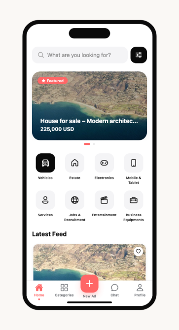
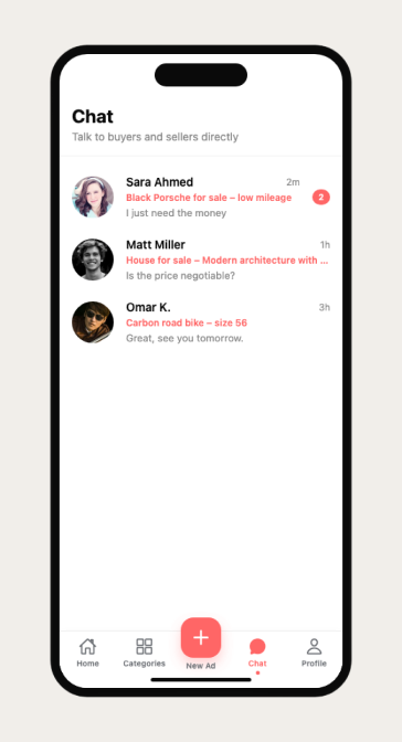
Research finding: users couldn’t locate the two most critical actions. The sell button was in a hamburger menu; messaging was nested inside notifications. I moved both to permanent tab bar positions, a prominent Sell FAB at center, and a dedicated Chat tab. Prototype testing showed task completion time for messaging a seller dropped from 18 seconds to 3 seconds.
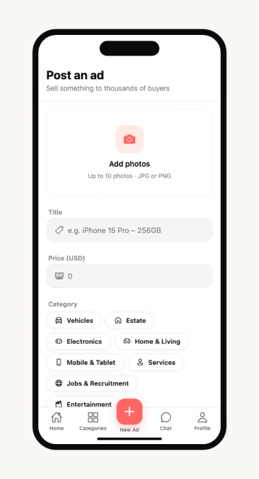
Research finding: the 14-field listing form caused 53% abandonment. I restructured it into three progressive steps, photos first (the highest-intent signal), then core details (title, price, category), then optional fields. Required fields went from 14 to 4. In prototype testing, 7 of 8 participants completed the flow on first attempt vs. 3 of 8 with the existing design.
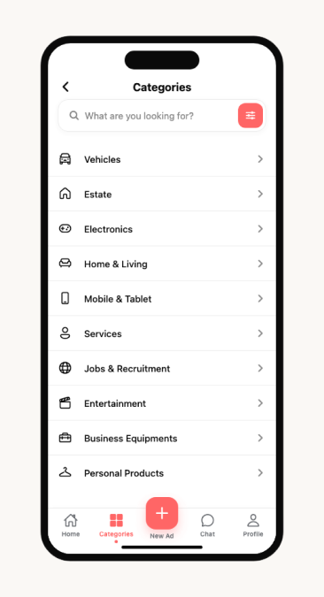
Research finding: search required keyword knowledge that less experienced users didn’t have. I replaced the search-first home screen with a visual category grid, large tappable cards organized by the 6 most-trafficked categories. Search remained accessible but moved from primary to secondary. Session recordings post-launch showed category browsing accounted for 62% of discovery.
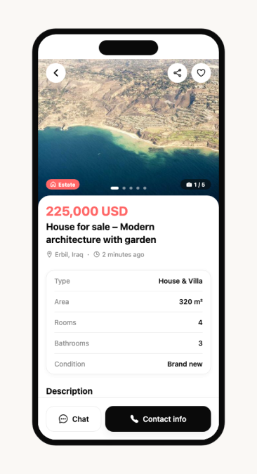
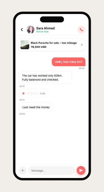
Research finding: on listing pages, only 12% of viewers messaged the seller, the CTA was a small icon competing with 6 other actions. I reduced the listing detail to one job: connect buyer to seller. Chat and Call became the only two actions, fixed at the bottom of every listing with high-contrast styling. Post-launch, buyer-initiated conversations per listing increased from 12% to 31%.
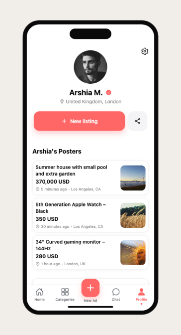
The communication hub and profile ecosystem, designed to build trust through transparency and reduce the median time from browse to first message.
The biggest unlock wasn’t a UI pattern, it was the decision to stop treating sellers and buyers as the same user with the same needs.
This project reinforced something I keep relearning: the most impactful design work usually looks like removal, not addition. We cut 10 fields from listing creation, removed 4 navigation items, and eliminated 2 full screens from the messaging flow. Each cut felt risky in stakeholder reviews, users might need that, and each one improved the metrics. The hardest conversation was convincing the founder that fewer features would grow the marketplace faster than more features. The data made that argument for us.
If I could redo one thing, I’d have pushed harder for a phased rollout. We shipped everything at once, which made it harder to attribute specific gains to specific changes. The +63% listing completion improvement was the aggregate, I suspect the progressive disclosure change alone accounted for most of it, but I can’t prove that cleanly.